


What is MVP Development Services?

What is MVP Development Services?
In the fast-paced world of startups and innovation, getting your product to market quickly and efficiently is key to staying ahead. This is where MVP (Minimum Viable Product) Development Services come into play. MVP development focuses on creating a basic version of your product that fulfills core functionalities, allowing you to test your concept with minimal investment. It’s an agile approach to validating ideas, reducing risks, and gathering valuable user feedback.
How Much Does It Cost to Develop an MVP?
The cost of MVP development depends on several factors:
- Complexity of Features: Simple MVPs with basic functionality can cost between ₹8,00,000 and ₹24,00,000. More complex MVPs with advanced features may range from ₹40,00,000 to ₹80,00,000 or more.
- Development Team: Hiring freelancers may cost less, but professional development agencies offer a more structured approach. Agencies typically charge ₹4,000 to ₹16,000 per hour depending on their expertise.
- Technology Stack: The choice of programming language, frameworks, and integrations affects cost.
- Location of Developers: Costs vary significantly based on geography. For instance:
- US/Europe: ₹8000-₹16,000/hour
- India/Asia: ₹1,600-₹4,000/hour
- Timeframe: The quicker you need your MVP, the higher the cost due to additional resources.
Pro Tip:
Investing in an experienced MVP development company ensures a balance of quality, efficiency, and cost-effectiveness.
The cost of MVP development services depends on several factors:
- Complexity of Features: Simple MVPs with basic functionality can cost between 200000rs – 500000rs. More complex MVPs with advanced features may range from 800000rs – 15,00,000rs or more.
- Development Team: Hiring freelancers may cost less, but professional development agencies offer a more structured approach. Agencies typically charge $50 to $200 per hour depending on their expertise.
- Technology Stack: The choice of programming language, frameworks, and integrations affects cost.
- Location of Developers: Costs vary significantly based on geography. For instance:
- US/Europe: $100-$200/hour
- India/Asia: $20-$50/hour
- Timeframe: The quicker you need your MVP, the higher the cost due to additional resources.
Pro Tip:
Investing in an experienced MVP development company ensures a balance of quality, efficiency, and cost-effectiveness.
A Look at Our MVP Development Process
At Infozion, we follow a well-structured process to deliver high-quality MVPs:
- Discovery Phase:
- Market Research: Understand the market landscape and target audience.
- Requirement Analysis: Identify essential features and define a clear scope.
- Prototyping and wireframing:
- Create visual prototypes to map out user flows and interfaces.
- Validate the design concept with stakeholders.
- Development Phase:
- Choose the right technology stack.
- Develop core functionalities based on priority.
- Testing and Feedback:
- Perform usability and functionality tests.
- Gather user feedback for iterative improvements.
- Launch and Support:
- Deploy the MVP to the market.
- Provide post-launch support and enhancements based on user insights.
Timeline for MVP Development
An average MVP development project takes 4 to 12 weeks, depending on complexity and scope.
Benefits of MVP Development Services
MVP development offers numerous advantages for startups and businesses:
1. Risk Mitigation:
- Test your idea in the market before committing to full-scale development.
- Identify potential flaws and rectify them early.
2. Cost Efficiency:
- Save resources by focusing on essential features first.
- Avoid investing in features that may not resonate with users.
3. Faster Time to Market:
- Launch your product quickly to capture market attention.
- Stay ahead of competitors by being the first mover.
4. User-Centric Approach:
- Gather real user feedback to refine and improve the product.
- Ensure the final product aligns with customer expectations.
5. Scalability:
- Build a foundation for adding features incrementally as the product evolves.
- Adapt to changing market needs efficiently.
Why Infozion is the Perfect Partner for Your MVP Startup
1. Expertise Across Domains
Infozion has a proven track record of delivering successful MVPs across diverse industries, including healthcare, fintech, e-commerce, and more.
2. Agile Development Methodology
We prioritize flexibility and adaptability, ensuring your MVP evolves with your needs and market trends.
3. Transparent Pricing
Our value-effective solutions are tailored to your budget without compromising on quality.
4. Experienced Team
Our team comprises experienced developers, designers, and strategists who are dedicated to your success.
5. Post-Launch Support
We offer robust post-launch support to ensure your product continues to thrive and grow.
Real-Life Success Stories with Infozion
Case Study: Supply chain MVP
- Challenge: A startup wanted to create a digital wallet with unique features.
- Solution: Infozion developed a user-friendly MVP within 4 months.
- Results: The startup secured $1.5 million in funding post-launch and scaled rapidly.
FAQs About MVP Development
Q1. What industries benefit most from MVP development?
Industries like technology, healthcare, education, and retail benefit greatly from MVPs due to their dynamic nature and need for user-driven innovation.
Q2. Can MVP development be done for mobile apps?
Yes, mobile app MVPs are highly popular. They allow businesses to test core functionalities before scaling up.
Q3. How do I choose the right MVP development company?
Look for:
- Proven experience in MVP development.
- Positive client reviews and case studies.
- Transparent pricing and timelines.
- Ongoing support services.
The concept of the solitary creative genius is a myth. When I first began as a UX designer, I felt like my designs had to be complete before I could show them to anyone.
I think this vulnerability stems from a feeling that we as designers have to think through every element before we can call a design complete.
As a result, it can be tempting to withdraw — to fully embrace the solitary UX designer stereotype — and assume the problems we’re facing are uniquely our own. But here’s the thing: usually another person on your team has dealt with similar challenges.
It can be nerve-wracking, vulnerable, and challenging at times, but getting out of our own heads and incorporating collaboration into our design processes can make us all better UX designer.
Over the years, I’ve come to learn that designing collaboratively means putting your egos aside to make something that transcends the sum of its creators.
Here are six ways you can be more collaborative based on our process at Constructive:
1. Start a Conversation

I spend most of my days independently thinking through interaction concepts and visual executions with prototypes, wires, sketches (lots of sketches), and of course .jpgs, .pdfs, and some .sketch files.
When I get to a place where I feel comfortable that most chips have landed in approximately the right places, I usually first reach out to my fellow UX designers to get quick initial reactions, advice on how to elevate the work, and general tips on what’s working and what’s not.
The computer can be the worst tool for problem-solving, so it’s critical to step away from your screen and talk through the work with another person to make sure your design intention is coming through and the system is intuitive enough for another person to use.
2. Embrace Internal Reviews

We always review internally before presenting designs to a client. This gives other UX designers on our team the chance to comment on the work. Talking through a design system with another person can be like a sieve for your own ideas.
What’s working? What’s an outlier? What are the ways we can extend the system? Usually, after we talk through a problem, I get the reassurance of how to go forward because I know how other people have interacted with the prototype.
It’s easy to justify a system’s flaws in your head when you’re the only person who’s seen the design, so it’s critical to get a second or third or fifth opinion on design so we can make certain the system works and is helpful for everyone.
It’s also good practice to test your ideas in presentation mode before having a formal client presentation. What sort of language am I using to describe the design?
Is it intuitive enough or do I have to explain my rationale in order for someone to understand the intention? If the latter is true, it’s a good indication that I might need to work through the design to get it to a place where it can exist without me explaining how the user should interact with it.
3. Incorporate Prototype Testing

A prototype can be anything. It can be a piece of paper, an interactive InVision board, a card sorting sitemap, or general experience that’s used to test how a typical user engages with a product.
When I’m uncertain about an assumption I have about design, it helps to do some informal user testing with the design team and other colleagues.
Testing with members of your team is a good exercise for thinking through basic user experience patterns because everyone brings a unique understanding of web accessibility standards and how to improve usability.
I did several rounds of user-testing on colleagues early on in the process of developing the UI UX for BMW before doing around with target audience members to streamline controls and make sure there was a base understanding of how it functioned.
4. Schedule Weekly Design Huddles

We also have weekly design hurdles that allow us to get aligned on what everyone is working on and give us the chance to have a focused conversation on trends, processes, and inspiration.
It’s important to come together as a group like this because it creates a forum for bringing up issues and opportunities that we’re experiencing as an individual UX designer.
5. Share Inspiration

Browsing the internet is primarily an individualized activity — unless of course, you’re forcing everyone around you to watch videos of thirsty pets. We try to share and keep an organized record of all the things we see online that inspire us. We do this by using slack channels.
This is an important practice because it makes browsing the internet a more collaborative activity. It allows us to understand each other’s reference points. And since we’re continuously learning from new experiences, it’s important to share what speaks to us in creative, professional, or personal ways.
It’s also a good way to gauge what your competitors are doing and what techniques or trends are shifting the industry to new and exciting places. By keeping an inspiration library, we can easily reference industry-specific sites in project strategic briefs. It also helps us align as a design practice through having a shared knowledge base about our creative inspiration and aspirations.
6. Collaborate on Larger Projects

Larger projects demand even more collaboration between designers. Some of our recent team projects have been working on BMW and Aapka Advocate.
These projects have allowed us to put our egos aside and engage in meaningful conversations about what’s best for the overall project. It has been challenging to give constructive criticism on a colleague’s work, but when something is bothering one person, it’s usually bothering more too.
Giving each other feedback forces us to have tough conversations about what we’re trying to convey with our UX designs and understand if something isn’t as inclusive or accessible as it could be. Working toward one unified idea also allows us to learn collective processes and knowledge.
They didn’t know that much about production work before redoing the Constructive site. So They racked their brains for a few times figuring out how to optimize images for the web (see future insight).
It was only when the other UX designer started helping with production that we learned from each other to create a process that worked based on all our shared knowledge. Methodology and process solidify when they happen many times with different people over time.
Final Thoughts
Why am I telling you this? The obvious answer is that any team needs to collaborate to work successfully. That holds a nugget of truth, but the real answer goes much further.
No matter your discipline — design, development, content, or strategy — I believe we get better each day as individuals by engaging in challenging conversations with each other.
This in turn creates a much stronger, more powerful team.
So if you take anything from this, it’s that:
We all strive to create excellent work that conveys truth and value.
Our differences make us stronger together.
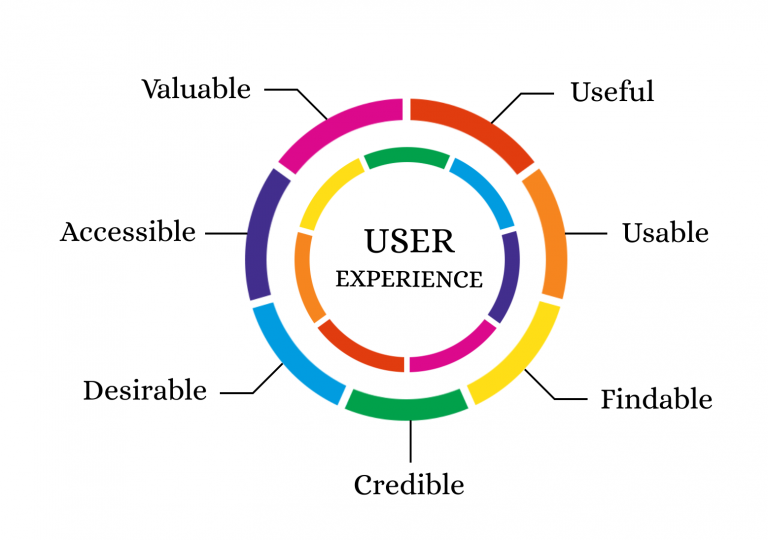
UX Design is the backbone of any website.

UX design is the process of enhancing user satisfaction by improving the usability, efficiency and accessibility of a website. Also, the conversion rate is directly proportional to the UX design of the website. Hence, the main emphasis of businesses is to hire the best UX designer.
But, a good UX design includes much more than an intuitive user flow and an eye-popping layout. A great User Experience will instantly elevate the browsing experience of the users. This, in turn, will lead to more traffic and increase in conversions.
Improving your User Experience will convert visitors into leads, buyers and brand advocates.
Here are 4 ways on how to improve the User Experience of your website:
1. Design a Clear Call to Action Button
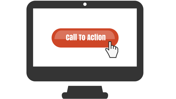
Call to Action(CTA) are the buttons that are used on a website to guide users towards conversion. The most common CTAs are: Start a trial, to sign up for updates, to download the app, book a consultation and many others.
Using a clear and attractive Call to Action button improves the user experience of any website. The Call to Action attribute should be placed on every page of the website. It has been observed that websites which have a clear CTA have higher conversion rates. Having a clear CTA also improves the overall user experience.
Moreover, if your website is designed in folds, it is important to keep your Call to Action above the fold so that it is easily visible to the users. Here are a few things that you should keep in mind:
- The colour of CTA matters. Using colours can make the CTA stand out and gives them more prominence. Use contrasting colours in CTA’s as compared to the colour scheme of the entire web page.
- The CTA text should be action-oriented. Avoid using passive verbs in the text. The text should be subtle yet active enough to prompt the user to take the requested action.
- While writing the Call to Action text, the word count should not be more than five words.
Hence, a clear and visible call to Action in your web design is imperative to a great User Experience.
2. Catch Your 404 Errors

While searching, users generally expect to land on the exact specific page they were searching for. In case they land an error, a 404 error in most cases, they will navigate to another site in their search for faster service.
Well, 404 errors have the capability to drive users away from your webpage. But, I understand, 404 errors are not completely unavoidable. So, how do you tackle the problem?
- The first step is to find out for which searches the 404 errors are displayed and then fix them as soon as possible.
- Rather than allowing your site to navigate to the standard ‘404 error: page cannot be displayed’ page, personalize the error messages so that users find them friendly and appealing.
- Use relevant, entertaining and pleasing images on the error page to reduce the annoyance caused to the user.
- Make it clear to the users that you will provide a comfortable and smooth browsing experience. To achieve that, customize the error text and add a personal touch to it.
While it is not possible to completely eliminate the error messages, fixing these no found errors will bring you one step closer towards designing a good UX.
3. Faster Page Loading Time

If your webpage loads slowly, it will frustrate the users who will eventually abandon your website and move on to another site which has a faster loading time.
It has been observed that if your page takes more than 2 seconds to load, the user leaves the website. Also, based on the loading time of your website, users decide whether to further visit your site or move on to another site.
So, if the landing page of your website is slow, there are high chances that the user might not even go through your website.
Remember, just improving the page load speed of the website for desktop is not enough. It is important to optimize for mobile users as well. With the mobile-first approach being promoted by Google, optimizing and designing your webpage for mobile users has to be done without fail.
There are many online tools which can help you check whether your website delivers a speedy user experience across all platforms. One of them is PageSpeed Insights by Google. Using this tool, if you enter the URL of the site you want to check, Google will highlight the areas where your page speed is weak and also give suggestions on how you can improve.
4. Use Authentic Images

Images instantly lift up any webpage and make the content visually appealing. But, the kind of image you choose, can make the overall design of the page appear good or bad.
Rule — Stay away from stock photos, always. While it is cheap and extremely easy to use stock photos, trust me, it will do more harm than good.
Stock images might look professional, but, within no time the users will be able to make out that these are stock images and thus lose interest.
Original photos draw more visitors as they have a realistic approach to them and the user can connect with them. Whereas stock images are overused and don’t appeal to the users.
One more thing to keep in mind is that using stock photos will send across a message to the sure that you have not invested much effort in designing the website. Also, it won’t look unique as they might have already seen it somewhere else.
So, always use authentic images, no matter how basic and simple they might look. But, stay away from stock photos.
Conclusion:-
A great User Experience is not just about providing useful information. Rather, it includes providing useful information in an engaging and pleasing manner. No matter how good your service or product is; if it is not able to catch the users attention, it is not enough.
Hence, invest time and efforts and to create an engaging website design. Rest assured, your focus and efforts on improving the User Experience of your website will surely generate more traffic and improve conversion rates.